CSS
CSS + HTML only art (no javascript)
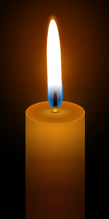
Candle
Glowing Candle by Takuma
<div class="holder">
  <div class="candle">
    <div class="blinking-glow"></div>
    <div class="thread"></div>
    <div class="glow"></div>
    <div class="flame"></div>
  </div>
</div>
@import url('https://fonts.googleapis.com/css?family=Ubuntu:400,400i,700,700i');


*, *:before, *:after {
    margin: 0;
    padding: 0;
    word-break: break-all;
  box-sizing: border-box;
  scroll-behavior: smooth;
}

html {
  font-size: 10px;
}

body {
    font-family: 'Ubuntu', sans-serif;
    color: #6e6e6e;
    font-size: 1.6rem;
  background: black;
}

header, footer {
  display: block;
}

a, a:link, a:visited {
  text-decoration: none;
}

img {
    border: 0;
}

ul {
    list-style: none;
}

.center {
  width: 1170px;
  margin: 20px auto 0;
}

.holder {
  margin: 12rem auto 0;
  width: 150px;
  height: 400px;
  position: relative;
}

.holder *, .holder *:before, .holder *:after {
  position: absolute;
  content: "";
}

.candle {
  bottom: 0;
  width: 100px;
  height: 300px;
  border-radius: 150px / 70px;
  box-shadow: inset 20px -30px 50px 0 rgba(0, 0, 0, 0.4), inset -20px 0 50px 0 rgba(0, 0, 0, 0.4);
  background: #190f02;
  background: -moz-linear-gradient(#e48825, #e78e0e, #833c03, #4c1a03 50%, #1c0900);
  background: -webkit-linear-gradient(#e48825, #e78e0e, #833c03, #4c1a03 50%, #1c0900);
  background: -o-linear-gradient(#e48825, #e78e0e, #833c03, #4c1a03 50%, #1c0900);
  background: -ms-linear-gradient(#e48825, #e78e0e, #833c03, #4c1a03 50%, #1c0900);
  background: linear-gradient(#e48825, #e78e0e, #833c03, #4c1a03 50%, #1c0900);
}

.candle:before {
  width: 100%;
  height: 40px;
  border-radius: 50%;
  border: 2px solid #d47401;
  background: #b86409;
  background: -moz-radial-gradient(#eaa121, #8e4901 45%, #b86409 80%);
  background: -webkit-radial-gradient(#eaa121, #8e4901 45%, #b86409 80%);
  background: -o-radial-gradient(#eaa121, #8e4901 45%, #b86409 80%);
  background: -ms-radial-gradient(#eaa121, #8e4901 45%, #b86409 80%);
  background: radial-gradient(#ffef80, #b86409 60%);
  background: radial-gradient(#eaa121, #8e4901 45%, #b86409 80%);
}

.candle:after {
  width: 34px;
  height: 10px;
  left: 50%;
  transform: translateX(-50%);
  border-radius: 50%;
  top: 14px;
  box-shadow: 0 0 20px 0 rgba(0, 0, 0, 0.5);
  background: -moz-radial-gradient(rgba(0, 0, 0, 0.6), transparent 45%);
  background: -webkit-radial-gradient(rgba(0, 0, 0, 0.6), transparent 45%);
  background: -o-radial-gradient(rgba(0, 0, 0, 0.6), transparent 45%);
  background: -ms-radial-gradient(rgba(0, 0, 0, 0.6), transparent 45%);
  background: radial-gradient(rgba(0, 0, 0, 0.6), transparent 45%);
}

.thread {
  width: 6px;
  height: 36px;
  top: -17px;
  left: 50%;
  z-index: 1;
  border-radius: 40% 40% 0 0;
  transform: translateX(-50%);
  background: #121212;
  background: -moz-linear-gradient(#d6994a, #4b232c, #121212, black, #e8bb31 90%);
  background: -webkit-linear-gradient(#d6994a, #4b232c, #121212, black, #e8bb31 90%);
  background: -o-linear-gradient(#d6994a, #4b232c, #121212, black, #e8bb31 90%);
  background: -ms-linear-gradient(#d6994a, #4b232c, #121212, black, #e8bb31 90%);
  background: linear-gradient(#d6994a, #4b232c, #121212, black, #e8bb31 90%);
}

.flame {
  width: 24px;
  height: 120px;
  left: 50%;
  transform-origin: 50% 100%;
  transform: translateX(-50%);
  bottom: 100%;
  border-radius: 50% 50% 20% 20%;
  background: rgba(255, 255, 255, 1);
  background: -moz-linear-gradient(white 80%, transparent);
  background: -webkit-linear-gradient(white 80%, transparent);
  background: -o-linear-gradient(white 80%, transparent);
  background: -ms-linear-gradient(white 80%, transparent);
  background: linear-gradient(white 80%, transparent);
  animation: moveFlame 6s linear infinite, enlargeFlame 5s linear infinite;
}

.flame:before {
  width: 100%;
  height: 100%;
  border-radius: 50% 50% 20% 20%;
  box-shadow: 0 0 15px 0 rgba(247, 93, 0, .4), 0 -6px 4px 0 rgba(247, 128, 0, .7);
}

@keyframes moveFlame {
  0%, 100% {
    transform: translateX(-50%) rotate(-2deg);
  }
  50% {
    transform: translateX(-50%) rotate(2deg);
  }
}

@keyframes enlargeFlame {
  0%, 100% {
    height: 120px;
  }
  50% {
    height: 140px;
  }
}

.glow {
  width: 26px;
  height: 60px;
  border-radius: 50% 50% 35% 35%;
  left: 50%;
  top: -48px;
  transform: translateX(-50%);
  background: rgba(0, 133, 255, .7);
  box-shadow: 0 -40px 30px 0 #dc8a0c, 0 40px 50px 0 #dc8a0c, inset 3px 0 2px 0 rgba(0, 133, 255, .6), inset -3px 0 2px 0 rgba(0, 133, 255, .6);
}

.glow:before {
  width: 70%;
  height: 60%;
  left: 50%;
  transform: translateX(-50%);
  bottom: 0;
  border-radius: 50%;
  background: rgba(0, 0, 0, 0.35);
}

.blinking-glow {
  width: 100px;
  height: 180px;
  left: 50%;
  top: -55%;
  transform: translateX(-50%);
  border-radius: 50%;
  background: #ff6000;
  -webkit-filter: blur(50px);
  -moz-filter: blur(60px);
  -o-filter: blur(60px);
  -ms-filter: blur(60px);
  filter: blur(60px);
  animation: blinkIt .1s infinite;
}

@keyframes blinkIt {
  50% { opacity: .8;}
}